Showing posts with label Artist Reviews. Show all posts

Sunday, April 14, 2013

Artist Review: Web Designer Kardo Ayoub


Cardo Ayoub is a web and graphic designer currently living in London. He ended up in London in order to continue his education after completing his college education in Holland. Cardo uses Photoshop, Illustrator, WordPress, and Dreamweaver to make the magic happen with his web design, and uses CSS and XHTML coding. Beyond web and graphic design, he also has an interest in photography and screen printing in terms of art.


In the artist's words, his webdesign focuses on "usability, accessibility, and attention to small details." In general, his webdesign is simplistic but not plain, combining interesting graphics with a simple, usable user interface. Oftentimes, but not always, his interfaces are split up by columns. He does, however, have a few interesting designs made that are less rigid, with buttons over an image background or a more rounded design.


In general, Cardo's websites are the kind of sites I like to see, especially when visiting a business. They get to the point, keeping the interface usable while still being engaging. I especially enjoy the graphical component to the sites, which keeps the websites from seeming boring or generic, both of which can be potential turnoff for clients or other visitors to the website. While some web designers might value a more complex interface, I think that the simple format of Cardo's designs makes for both more usable and more engaging viewing.

Source used:

Cardo Ayoub's Website: http://www.kardoayoub.co.uk/

Sunday, March 3, 2013

Artist Review: Cristiano Siqueira


Cristiano Siqueira, aka Crisvector, is a vector artist from Brazil whom I found after doing a quick Google search for realistic vector artists. .He began his art career using Illustrator, Photoshop, and other such programs. He began learning vector art for his first job, where he was retracing logos as vector images. He would later go on to use the skills he acquired in illustrator to digitally ink his hand-drawn works and later to add color to them as well. He begins his works in sketch form, making 3 or 4 versions of them before moving to Photoshop to redraw them and finally moves on to Illustrator to refine them.


Some of Chrisvector's work is more realistic in nature, taking on realistic shading and contours in the lines and the colors. Other pieces are not so realistic, looking more hand-drawn or non-realistic digital. He makes use of many different tools in illustrator, the blend tool in particular, to give his looks a wide variety of looks. He has done both his own work as well as commercial art, having done art for companies such as Nike, Gillette, The Wall Street Journal, and Playboy, though this is not a complete list.


My eye was initially caught by Chrisvector's more realistic works, but after looking over his other material I have grown to enjoy the more hand-drawn look as well as the realistic. There are many different emotions conveyed and themes portrayed in his wide variety of works. Some might say that his lack of focus in one style means he is not steadily improving in any of them, but I would disagree. I think it is highly beneficial for an artist to have experience in multiple styles, and Chrisvector is no exception. I have provided links to his website and some other websites including images and an interview if you wish to learn more about him.


Resources used:
http://vector.tutsplus.com/articles/interviews/interview-with-cristiano-siqueira-aka-crisvector/
http://www.crisvector.com/folio/about/
http://www.behance.net/crisvector#page=1&sort=creatives_order

Monday, February 18, 2013

Artist Review: Harold Cohen


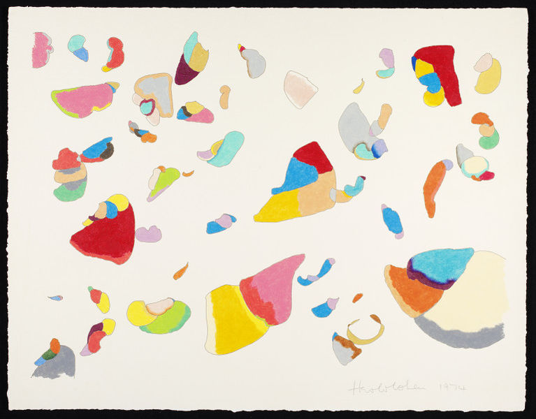
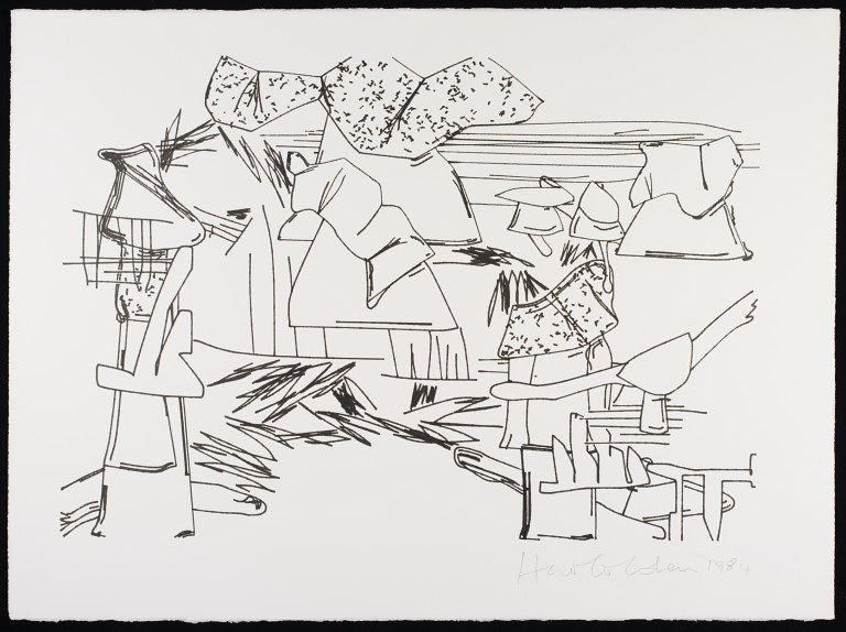
Born in London in 1928, Harold Cohen studied at the Slade School of Fine Arts in London before becoming a teacher there himself and eventually joining the Visual Arts Dept. in 1968. His digital work did not begin until he moved to San Francisco, when he became interested in computer programming and in artificial intelligence. in 1971, he was invited to spend 2 years at the Artificial Intelligence Laboratory of Stanford University. The most important result of this, in relation to his art, is the ongoing programming project called AARON, which produces art that looks like freehand work. AARON has been producing artwork, in multiple styles, since the 70's into the modern day.

Some of the computer generated worked produced by Cohen are more abstract, like the one I began this post with. Others, like the one to the left, have clearer, more recognizable figures in them. AARON's earliest works were just in black and white, but as can be seen in its later works it moved on to color. This switch to color from black and white creates an almost more human element to the works, even though they are created entirely by a program, making them feel warmer and more welcoming to the eye. In a way, it shows a sort of evolution in the program's works, much like you would see in a human artist, though ultimately this evolution is brought on by the one altering the program.

I enjoy the works created by Cohen and AARON mostly because I enjoy seeing what computers are capable of when left mostly to their own devices. I find it fascinating that a computer, given the right input, can create both images we could easily attribute to a computer and images that we could easily mistake for having been hand drawn. Though one might say that there is something missing from completely computer generated artwork, some sort of emotional quality that is missing, I would say this is not the case. Though the art itself is computer generated, some human input had to go into it to help produce the images, and I believe that is enough to help the computer produce a piece that has just as much emotional value as something produced entirely by hand.

Information from:
http://www.kurzweilcyberart.com/aaron/hi_cohenbio.html
http://www.medienkunstnetz.de/artist/cohen/biography/
http://en.wikipedia.org/wiki/AARON

Images From:
http://collections.vam.ac.uk/name/cohen-harold/6433/

Wednesday, February 6, 2013

Artist Review: David Fuhrer

"The Homeworld" (2010) (Original Image at: http://www.behance.net/gallery/The-Homeworld/421212)

David Fuhrer is an artist born in Switzerland in 1985 whom I first found out about through a blog post titled "20 Amazing Digital Artists to Follow on Behance" (Link can be found at the end of this post). He is a self-taught digital artists who uses programs such as Adobe Photoshop, Sketchbook, and Painter to create his works. Fuhrer began his work with digital art in 2004/2005 and began his official portfolio in 2005. He states that his work is based on "imagination and life" and can take anywhere between weeks and months to create. In addition to being a digital artist, he also does work as an interactive designer.


"BotWorld" (2010) (Original Image at: http://www.behance.net/gallery/Misc-Artworks/740752)


"Heart Shaped Box" (2010) (Original Image at: http://www.behance.net/gallery/Misc-Artworks/740752)


Fuhrer's works range from fantastical landscape type pieces, such as BotWorld above and The Homeworld at the beginning of this post, to more abstract pieces, like the above Heart Shaped Box and Red Apple below. The other piece I have included below, Drug-Free Zone, falls somewhere in between. He describes his favorite types of works to create as "something surreal. I don't like real things too much." This is very clear in his work, as the wide variety of colors and unusual shapes in his art create an image of a fantasy world where reality doesn't apply. The brightness of many of the pieces creates a sort of welcoming feeling, like the places in the art would be a fun place to go. There are a few pieces that go against this theme in his portfolio though, such as Black Death, which I have included later in this post.


"Red Apple" (2009) (Original Image found at: http://www.behance.net/gallery/Red-Apple/166190)


"Drug-Free Zone" (2007) (Original Image found at: http://www.behance.net/gallery/Drug-Free-Zone/51890)


I really enjoy Fuhrer's work because of how surreal they are. I have always enjoyed art of novel landscapes, and the bright colors and fantastical landscapes and objects in his works immediately drew me in the first time I saw one of his pieces. His art does not, on the whole, necessarily have a lot of deeper meaning to it, but I don't think that takes away from it. I can still look at his pieces, especially his landscape works, and imagine what it might be like to be there and what sorts of things might happen in such a place, and I think that for a piece of art to have that kind of draw and power is a very positive quality. I simply do not have the space to include every one of his works that I like here; I recommend visiting his portfolio on Behance if you are interested in viewing more of his work.


 (At Right: Black Death (2010) (Original Image found at: http://www.behance.net/gallery/Black-Death/746909)


At Left, Above and Below: "Air" (2007) (Original Image found at:  http://www.behance.net/gallery/Air/51893)


All quoted text in this post is taken from Fuhrer's interview with Emil Agarunov, cited below.


Websites used:
Agarunov, Emil "Interview with David Fuhrer, AKA Microbot" psd tuts+. Web. http://psd.tutsplus.com/articles/inspiration/interview-with-david-fuhrer-aka-microbot/

Fuhrer, David "David Fuhrer" Behance. Web. http://www.behance.net/Microbot#page=1&sort=creatives_order

Wednesday, January 16, 2013

Craig Kalpakjian


Corridor (1997) (Original image found at: http://www.kalpakjian.com/work2.html)


Craig Kalpakjian is an American digital artist born in 1961, whom I first learned about in Christine Paul's book Digital Art (World of Art). Much of his work revolves around "everyday landscapes", most notably office spaces or other indoor areas. His work is described by Christine Paul as "Seeming eerily real yet are completely computer generated" (Paul 42). His works are created through the creation of a digital model in an architectural design program which is then altered through changes in lighting, shading, and texture ("Corridor II") The above work, Corridor, is a still image that is part of a video that takes the view through an endless corridor of what appears to be an office building of some kind. The video version can be seen here.

 Room (1999) (Original image found at: www.kalpakjian.com/work1.html)

Kalpakjian's works are indeed very realistic looking in nature, but there is an emptiness to them, a lack of any sort of life that sets them apart from their real world counterparts. In this way, the corridors and buildings that Kalpakjian creates emphasize how artificial our modern day landscapes can seem when the human element is removed from them. Christine Paul describes his work as "[alluding] to the artificiality of many of the environments and office buildings we inhabit on a daily basis" and as showing "the alienating effects induced by modern architecture" (Paul 42). The landscapes have a sort of eerie, alien feel to them, many of them not including furniture or any sort of evidence of human presence at all, simply a room, or part of a room, that a computer might build or design, perfect in measurement but lacking any actual substance.

Lobby (1996) (Original image found at: http://www.kalpakjian.com/work2.html)

Corridor II (1998) (Original Image found at: www.kalpakjian.com/work1.html)

I was drawn to Kalpakjian's pieces because of how he captures an alien emptiness in otherwise familiar, mundane scenes. Though his works are not particularly variable in nature, focusing almost entirely on office building scenes, Kalpakjian does an excellent job in capturing how truly artificial those scenes are in the real world by creating them in a fully digital format and removing all human elements from the scene. Though one could argue that his works, though certainly realistic, are overly simplistic, I would argue that that quality strengthens the message of the work; if he were to add too much detail to his scenes, Kalpakjian's works would lose their sense of artificiality and maintain too much of the human element that it seems he has tried to remove.

Monitor (1998) (Original image found at: http://www.kalpakjian.com/work1.html)

Sources used:

"After Photoshop: Manipulated Photography in the Digital Age". Craig Kalpakjian. Web. http://www.kalpakjian.com/index.html.

 "Corridor II". The Metropolitan Museum of Art: Corridor II. The Metropolitan Museum of Art. Web. http://www.metmuseum.org/Collections/search-the-collections/190036524

Paul, Christine. Digital Art (World of Art). Thames & Hudson, 2003. Print.